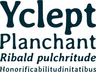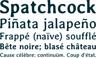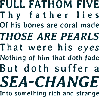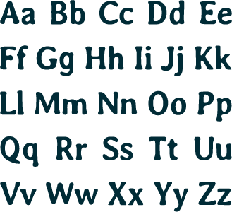
 am not a type designer. This is the story of the creation of a new font,
Avería: the average of all the fonts on my computer. The field of typography
has long fascinated me, and I love playing with creative programming
ideas, so it was perhaps inevitable that the idea came to me one day of
“generative typography”. A Google on the subject brought up little, and I
put the idea to the back of my mind until it occurred to me that perhaps the process of
averaging, or interpolating, existing fonts might bring up interesting results. Luckily at this
point I didn't do any more web searching – instead I grabbed
my laptop and came up with an initial idea for finding what the average of all
my fonts might look like – by overlaying each letter at low opacity. The results
can be seen in the below image.

This was done by printing each letter of each font, at the same point size,
to lots of separate images, and then averaging them – using ImageMagick and PHP.
The letters were
aligned to the same centre point. I later realised that each font has a ‘baseline’ defined, and
an origin on that baseline which each glyph is drawn relative to. The same process,
repeated with equal origins, gives slightly different results (see below) – here
you can see the baseline is very well-defined, with the glyphs becoming more blurred towards the top right of each.

I was quite pleased with the results. It was only later that I discovered this had already been done – though it appeared that my end results (whilst not as beautifully animated) had a little more clarity, so I'm glad I tried for myself. But this didn't seem like the end of the journey. Whilst this was an interesting experiment, and showed an lot of correlation between a sample of common fonts (as well as a couple of oddities – notably the lower case ‘g’ which clearly exists in two distinct common forms), what I really wanted was an average which somehow preserved the well-defined edges of existing fonts. So I started considering ways to produce a smoother, sharper average of letter forms.
One idea which seemed obvious was to simply take the blurry results of the
first experiment, and use a threshold to create monochrome images. A few experiments in this
direction (I first tried with a lower-case ‘f’, which I later found was never
likely to give good results due to the variance in height of the middle
cross-stroke) convinced me that I needed to look into cleverer ways to achieve
this.
Surely there must be a simple way to average shapes, while keeping the result as a
shape?


It turns out not to be straightforward. There are many possible
ways to ‘morph’ between two shapes – and what might seem the most natural
generally depends on our perception of ‘features’ in the shapes. Consider the
average of a capital I with serifs, and one without: the natural thing to do
would be something like, make the serifs half as big, and use a horizontal stem
width about half-way between the two glyphs. That's two feature concepts being
applied to the abstract forms¹. To take a simpler example, what is the
average of a square with the same square rotated 45˚? There are a few
possibilities …


So, this stumped me for a while. I decided I needed to get to know fonts
better, so I built a simple web app to view the lines, curves and control points
present in the fonts I had. On this basis, I started to consider the ways the
features (vertices, curves, stems, serifs etc) might be matched up between fonts.
However, this was a rabbit hole I might never get to the bottom of -
particularly when considering some of the more unusual varieties of font.
Perhaps there was a simpler idea that was evading me.
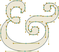
Then it occurred to me: since my aim was to average a large number of fonts, perhaps it would be best to use a very simple process, and hope the results averaged out well over a large number of fonts. So, how about splitting each letter perimeter into lots of (say, 500) equally-spaced points, and just average between the corresponding positions of each, on each letter? It would be necessary to match up the points so they were about the same location in each letter, and then the process would be fairly simple².
Having found a simple process to use, I was ready to start. And after about a month of part-time slaving away (sheer fun! Better than any computer game) – in the process of which I learned lots about bezier curves and font metrics – I had a result. I call it Avería – which is a Spanish word related to the root of the word ‘average’. It actually means mechanical breakdown or damage. This seemed curiously fitting, and I was assured by a Spanish friend-of-a-friend that “Avería is an incredibly beautiful word regardless of its meaning”. So that's nice.
Along the way I naturally called on the counsel of the best designers
I know – my brother Nick Sayers, Lloyd Thomas, Tom Muller and
Chris McGrail, for
advice. In the end, I decided to release the font using the SIL Open Font
License – which means anyone can use it pretty much however they like – and to
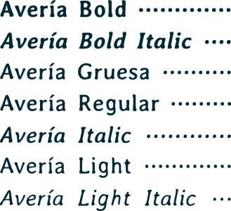
include within the family Regular, Bold and Light variants with Italics. Each is
made from the corresponding subsets of the fonts on my machine. Also
included is a “Gruesa” version made from all my fonts (725 in total).
Avería Family (ZIP, 369kB) [Updated 9 Nov 2011]
Avería at The Open Font Library
*NEW* by popular demand:
Avería Serif Family (ZIP, 323kB) OFLB
Avería Sans Family (ZIP, 320kB) OFLB
*NEW* Avería, Serif and Sans packaged as TTC TrueType collections (so you can install each family in one go, rather than one variant at a time). Thanks Ludwig:
Avería TTC Files (ZIP, 946kB)
*NEW* versions of Avería, based on OFL fonts from the Google Web Fonts directory - now available through GWF as Avería Libre:
Avería GWF Family (ZIP, 488kB)
Avería Serif GWF Family (ZIP, 432kB)
Avería Sans GWF Family (ZIP, 426kB)
Preview all
Feel free to email me if you have any questions – or use the comments box below.
N.B. I've had a number of emails from people asking if they can use Avería in various commercial / non-commercial projects. I'd love to hear if you do something with these fonts – but there's no need to ask permission. You are absolutely free to use them however you like.
